

Quality Managementウィジェットは、組織のQMプロセスの概要を提供します。 エージェントのパフォーマンスを把握し、品質向上のためのステップを決定することができます。 ウィジェットをドラッグアンドドロップするか、ダブルクリックして、ダッシュボードに追加することができます。 また、設定を使って、データを表示するためのフィルタを追加することもできます。
すべての履歴データ分析ウィジェットでは、25 か月の遡及期間内で最大 95 日間のデータを表示できます。
ウィジェットとCXone Mpowerウィジェットの概要を説明する短いDashboardeラーニングQMを受講できます。 このコースでは、さまざまなQMウィジェットと、ダッシュボードで使用できるウィジェット設定について説明します。
CXone MpowerアプリケーションにQuality Managementが含まれていない場合、これらのウィジェットは表示されません。
カテゴリー推移
データ更新間隔:1分以内
ウィジェット更新間隔:30分
このウィジェットは、特定の時間における特定のカテゴリのインタラクションのボリュームを確認するのに役立ちます。 ウィジェットのグラフは、選択したカテゴリの一定期間の傾向を表示します。
この知識があれば、特定のカテゴリにさらに焦点を当てるために品質プランを変更する必要があるかどうかを判断できます。
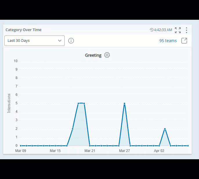
新しいページで開く
 をクリックすると、Interactionsに移動して、追加の調整詳細を見ることができます。
カテゴリーを選択する
![]() をクリックしてカテゴリーを追加します。
をクリックしてカテゴリーを追加します。
-
自動:CXone Mpowerは、インタラクションの数が最も多いカテゴリを自動的に表示します。
-
手動:経時的に追跡したいカテゴリを選択できます。
ウィジェットのオプション をクリックし、次に設定をクリックして、各ウィジェットに表示するデータをフィルタリングできます。
フィールドの説明
-
表示名:ウィジェットの名前を指定します。
-
日付範囲:日付の範囲を定義します。 今日、昨日、直近の7日間、直近の30日間、直近の90日間、先週、先月およびカスタム範囲ようなオプションから選択することができます。
-
チーム:ウィジェットに含めるチームを選択します。 選択したチームからのエージェントのみが表示されます。
品質管理者は、カテゴリのインタラクションボリュームが時間の経過とともにどのように変化するかを確認できます。
このウィジェットを使って、スーパーバイザーと評価者は特定のカテゴリに焦点を当て、品質戦略に変更を加えて評価されるインタラクションのタイプを変更することができます。 また、そのボリュームの処理に時間がかかっているエージェントに対しては、より効果的な処理方法のコーチングに注力できます。
評価とコーチングのトレンド
データ更新間隔:30分
評価とコーチングのトレンドウィジェットを使用すると、選択したエージェントの評価スコアが時間の経過とともにどのように変化するかを追跡できます。 また、新しいCoaching経由で送信されたコーチングセッションも表示します。 このウィジェットは、マネージャーがスコアの傾向を特定し、エージェントに割り当てられているコーチングセッションを表示するのに役立ちます。
一度に最大50人のエージェントを選択できます。 エージェントはアルファベット順に選択されるため、より効率的で管理しやすい分析プロセスが保証されます。 エージェントスコアにカーソルを合わせると、その日の平均スコアと個別スコアが表示されます。
エージェントスコアをクリックすると、インタラクションを再生し、セグメントタイプ評価の評価フォームを表示できます。 ただし、従業員タイプの評価では、評価フォームのみを表示できます。 異議または抗議を受けた評価の場合、評価フォームではなく、インタラクションプレーヤーのみが表示されます。
時間枠を選択してドラッグすると、スコアを拡大表示することができます。 ズームアウトするにはZoomをクリックします。
ウィジェットのオプションをクリックし、次に設定をクリックして、各ウィジェットに表示するデータをフィルタリングできます。
フィールドの説明
-
表示名:ウィジェットの名前を指定します。
-
日付範囲:日付の範囲を定義します。 今日、昨日、直近の7日間、直近の30日間、直近の90日間、先週、先月およびカスタム範囲ようなオプションから選択することができます。
-
チーム:ウィジェットに含めるチームを選択します。 選択したチームからのエージェントのみが表示されます。
評価とコーチングイベント
データ更新間隔:5分以内
評価およびCoachingイベントウィジェットでは、選択したエージェントの評価スコアの一定期間における推移を確認できます。 また、選択したエージェントのコーチングイベントを確認することもできます。
評価スコアの推移を見ることで、特定のエージェントにコーチングが必要かどうかを判断できます。 ウィジェットは、コーチングやコーチングへの投資がエージェントの品質スコアに影響を与えたかどうかを監視するのに役立ちます。
ウィジェットは、パーセンテージの平均ではなく値の平均を使用して、エージェントの全体的な評価スコアを計算します。 値の平均は、評価における各セクションの重要性を考慮します。 平均スコアの詳細についてはこちらをクリックしてください。
エージェントスコアにカーソルを合わせると、その日の平均スコアと個別スコアが表示されます。
エージェントスコアをクリックすると、インタラクションを再生し、セグメントタイプ評価の評価フォームを表示できます。 ただし、従業員タイプの評価では、評価フォームのみを表示できます。 異議または抗議を受けた評価の場合、評価フォームではなく、インタラクションプレーヤーのみが表示されます。
さらに、エージェントドロップダウンから特定のエージェントを選択し、評価とコーチングのトレンドを確認できます。 この機能を使用すると、個々のエージェントのパフォーマンスを時系列で追跡し、特定のエリアでの進捗状況を分析できます。
時間枠を選択してドラッグすると、スコアを拡大表示することができます。 ズームアウトするにはZoomをクリックします。
ウィジェットのオプションをクリックし、次に設定をクリックして、各ウィジェットに表示するデータをフィルタリングできます。
フィールドの説明
-
表示名:ウィジェットの名前を指定します。
-
日付範囲:日付の範囲を定義します。 今日、昨日、直近の7日間、直近の30日間、直近の90日間、先週、先月およびカスタム範囲ようなオプションから選択することができます。
-
チーム:ウィジェットに含めるチームを選択します。 選択したチームからのエージェントのみが表示されます。
-
グループ:選択したチーム内のエージェントを、割り当てられたグループによりフィルタリングします。 エージェントドロップダウンで選択され、グループフィルタで少なくとも1つのグループに所属するエージェントのみが、ウィジェットにアクセスできます。
スーパーバイザーは、自分が指導したエージェントや評価済みのエージェントを確認することができます。 コーチングセッション後にエージェントの行動が変化した場合、品質スコアは上昇します。 コーチング後のエージェントのスコアに変化がない場合、そのエージェントの品質スコアは下がります。 その場合、スーパーバイザーはコーチングの内容や方法を調整する必要があります。
コーチングを受けてもエージェントのスコアが上がらない場合、マネージャーはそのスーパーバイザーにコーチングが必要かどうかを確認できます。
評価者の調整
データとウィジェットの更新間隔: 30分
このウィジェットは、選択した時間枠中に完了した調整への参加に基づいて、差異が最も大きい評価者を表示します。 これには、すべての評価者が期限前に割り当てられた調整評価を完了した完全な調整のデータのみが含まれます。
完了ステータスは、>調整のMy Zone完了率列で確認できます。 たとえば、調整が15人の参加者に送信された場合、データがこのウィジェットに表示されるには、15人全員がそれを完了する必要があります。 QMレポート内で不完全な調整のデータにアクセスできます。
このウィジェットに表示される情報から以下のことを確認できます。
-
差異±5%または品質マネージャーが決定した割合の範囲内のスコアを出す評価者。
-
評価者のインタラクションのスコアリング精度と、採点が苦手な評価者。
新しいページで開く をクリックすると、My Zoneの調整に移動し、追加の調整の詳細を確認できます。
ウィジェットのオプションをクリックし、次に設定をクリックして、各ウィジェットに表示するデータをフィルタリングできます。
フィールドの説明
-
表示名:ウィジェットの名前を指定します。
-
分散しきい値:評価者の調整スコアの分散のしきい値の割合を定義します。 評価者の差異割合が絶対値を超えている場合はオレンジ色で表示されます。
-
日付範囲:日付の範囲を定義します。 今日、昨日、直近の7日間、直近の30日間、直近の90日間、先週、先月およびカスタム範囲ようなオプションから選択することができます。
-
評価者:評価者の名前を選択します。
品質管理者は、関連する調整でどの評価者のスコアが他の評価者よりも高いまたは低い傾向があるかを確認し、その評価者に品質スコアのコーチングが必要かどうかを判断できます。
評価者のパフォーマンス
データ更新間隔:30分
このウィジェットは、評価者のパフォーマンスを監視するのに役立ちます。 このウィジェットでは、完了した評価の割合と異議を申し立てられた評価の数に基づいて、評価者のパフォーマンスを追跡できます。
[ウィジェット表示]で、[テーブル]、[完了済み評価のトレンド]、[比較]のいずれかを選択できます。
テーブルビュー
-
テーブルビューでは、完了済み評価と異議申し立て済み評価の割合とともに評価者のリストを確認できます。
-
評価者の完了した評価にカーソルを合わせると、期限切れ、保留中、削除済みおよび交換済みの評価の数が確認できます。
-
テーブルに列を追加して、合計評価数、削除済、交換済、期限切れ、に関連する詳細情報を表示できます控訴済 期限切れおよび削除済。 これらの列は、さまざまなメトリックにわたる評価者のパフォーマンスに関する追加情報を提供します。
-
 をクリックして、特定の列またはすべての列 サイズを自動調整します。
 -
 をクリックして、フィルタオプションを選択します。
 -
 をクリックして、ウィジェットに表示する列を選択します。
 -
プライマリソート列では、列タイトルの横に1と表示されます。
-
2番目のソート列では、列タイトルの横に2が表示されます。
次の手順で列をカスタマイズできます。
列のサイズ、ソート、フィルター、配置を調整することにより列の設定をパーソナライズし、ビューダッシュボード権限があってもこれらの変更を保存することができます。
テーブル列の並べ替え
列ヘッダーをクリックすると、テーブル内のデータを並べ替えることができます。 2 番目の並べ替えを適用するには、Shift キーを押しながら別の列ヘッダーをクリックします。
完成した評価トレンドビュー
完了した評価のトレンドビューでは、ドロップダウンで評価者のリストが表示され、特定の評価者を選択して、完了した評価を時系列で確認できます。
-
比較ビューでは、2人の評価者のパフォーマンスを比較し、相対的なパフォーマンスを把握できます。
-
また、比較は6つのカテゴリーにも拡張されます:完了、保留中、アピール済み、削除済、置き換え、期限切れ。 各評価者に割り当てられた評価の全体数が、比較円グラフの中央に表示されます。
-
評価者を選択して比較ビュー内のパフォーマンスを確認し、別の評価者を選択して直接比較します。 各評価者に対応するチャートにカーソルを合わせると、評価数とそれぞれの貢献度が表示されます。
比較ビュー
ウィジェットのオプションをクリックし、次に設定をクリックして、各ウィジェットに表示するデータをフィルタリングできます。
フィールドの説明
-
表示名:ウィジェットの名前を指定します。
-
日付範囲:日付の範囲を定義します。 今日、昨日、直近の7日間、直近の30日間、直近の90日間、先週、先月およびカスタム範囲ようなオプションから選択することができます。
-
日付パラダイム:特定の評価フォームとバージョンに基づいて日付パラダイムフィルターを定義します。
-
評価 Start 期間:開始時刻に基づいて評価をフィルタリングします。
-
評価提出済 期間:提出時間に基づいて評価をフィルタリングします。
-
記録されたインタラクション期間:記録されたインタラクションの期間に基づいてフィルタリングします。
-
-
オンザフライの評価:ウィジェットにオンザフライの評価を含めるには、はいを選択し、除外するには、いいえを選択します。
-
評価者:ドロップダウンから評価者名を選択します。
-
フォーム名とフォームバージョン:ドロップダウンからフォーム名とバージョンを選択します。これには、フォームのステータスも表示されます。
-
グループ:選択したチーム内の評価者を割り当てられたグループによりフィルタリングします。 フィルターで選択したグループに割り当てられた評価者のみがウィジェットに表示されます。
- 完了済みしきい値:しきい値範囲を設定することで、評価者の評価完了率を強調することができます。 たとえば、コンタクトセンターでの評価完了率が40%から80%の場合は次のようになります。
ウィジェットでは、割り当てられた評価の40%未満を完了した評価者が赤色で表示されます。
割り当てられた評価の40%から80%を完了した評価者は、グレーで表示されます。
80%以上の評価を完了した評価者は青色で表示されます。
-
異議申し立てのしきい値:ウィジェットに赤色で表示される評価者の不服申し立ての割合を設定できます。
このウィジェットを使って、品質マネージャーは評価者のパフォーマンスを追跡し、必要に応じてコーチングオプションにアクセスすることができます。 また、品質プログラムの健全性を判断するのにも役立ちます。
フォームの調整
データとウィジェットの更新間隔:30分
このウィジェットは、品質マネージャーが差異が大きい調整済みフォームを確認するのに役立ちます。 完全に完了した調整のデータのみを表示します。 調整は、割り当てられた評価者全員が指定の期限内に成績を提出したときに完了したと見なされます。
完了ステータスは、My Zone>調整の完了率列で確認できます。 たとえば、調整が15人の参加者に送信された場合、データがこのウィジェットに表示されるには、15人全員がそれを完了する必要があります。
このウィジェットでは、差異が高いということは、評価者間で質問の採点方法に一貫性がないことを示します。 品質マネージャーは、評価者がフォームの採点に困っていないかどうかを確認し、評価者のコーチングを行うことができます。 また、この情報に基づいて、採点要件やフォームの質問を修正することも可能です。
新しいページで開く
をクリックすると、マイゾーンの調整に移動して、追加の調整詳細を見ることができます。
ウィジェットのオプションをクリックし、次に設定をクリックして、各ウィジェットに表示するデータをフィルタリングできます。
フィールドの説明
-
表示名:ウィジェットの名前を指定します。
-
差異しきい値:フォームの調整スコアにおける差異のしきい値率を定義します。 フォームの分散割合が絶対値を超えている場合は赤色で表示されます。
-
日付範囲:日付の範囲を定義します。 今日、昨日、直近の7日間、直近の30日間、直近の90日間、先週、先月およびカスタム範囲ようなオプションから選択することができます。
-
フォーム名とフォームバージョン:ドロップダウンからフォーム名とバージョンを選択します。これには、フォームのステータスも表示されます。
このウィジェットを使用して、品質マネージャーは、評価者が各質問の採点方法を理解しやすいように、シンプルで明確な採点要件の必要性をフォームで確認することができます。
プランステータス
データとウィジェットの更新間隔:1時間
このウィジェットを使用すると、組織でアクティブな状態にある品質プランのステータスを確認することができます。 順調に進んでいる計画の割合と、各品質計画の内訳ビューを確認できます。 また、品質プランの進捗状況を把握することで、期限内に完了しないリスクのある計画を特別に把握することができます。
プランステータスウィジェットは、2つのセグメントビューを提供します。
進行状況ビュー
-
順調ビューには、完了ステータスの昇順でプランが表示され、最も遅延の多いプランが最初に表示されます。
-
順調ステータスでプランを自動選択するか、手動でプランを選択するかを選択できます。 自動選択の場合、完了状況に基づいて最大5つのプランを昇順で表示でき、最も遅延の多いプランを最初に表示します。
-
手動モードでは、表示するプランを最大5つ選択できます。
-
順調スコアは、その日の予想評価の総数に対する、その日の時点で完了した評価の割合です。
-
選択した品質プランは棒グラフで表示され、選択したプランにマウスを合わせると、完了、プラン終了日、および順調の詳細が表示されます。
-
順調スコアは、その日までに完了すると予想される評価の総数に対する、その日時点で完了した評価の割合です。
内訳ビュー
-
内訳ビューには、完了した評価が最も多い計画から降順で計画が表示されます。
-
内訳ビューでは、プランを評価ステータスごとに分類して表示できます。 このビューではプランが降順に表示され、最も完了に近い評価のあるプランが最初に表示されます。
-
このデータをMy Zoneの計画モニタリングページと比較できます。
-
品質プランでは、内訳ビューの評価の総数は、QMに分布されている評価を表します。
1月1日から1月31日までの品質計画があります。 この計画では、今月は10件の評価を完了することを目指しており、これは1日あたり平均0.32件の評価に相当します。
1月11日には1件の評価が完了しましたが、その日までに完了すると予想される評価数は3.55件です。 計画の進捗状況を追跡するために、次のように順調スコアを計算します。
順調スコア = 1/3.55 * 100 = 28.18%
これは、計画が現在28.18%順調に進んでいることを意味します。
新しいページで開く をクリックすると、My Zoneのプランモニタリングに移動し、品質プランの追加詳細を確認できます。
ウィジェットのオプションをクリックし、次に設定をクリックして、各ウィジェットに表示するデータをフィルタリングできます。
フィールドの説明
-
表示名:ウィジェットの名前を指定します。
-
ウィジェット表示:ビュータイプを「故障ステータス」または「オントラックステータス」から選択します。
-
日付パラダイム:特定の評価フォームとバージョンに基づいて日付パラダイムフィルターを定義します。
-
評価 Start 期間:開始時刻に基づいて評価をフィルタリングします。
-
評価提出済 期間:提出時間に基づいて評価をフィルタリングします。
-
記録されたインタラクション期間:記録されたインタラクションの期間に基づいてフィルタリングします。
-
-
日付範囲:日付の範囲を定義します。 今日、昨日、直近の7日間、直近の30日間、直近の90日間、先週、先月およびカスタム範囲ようなオプションから選択することができます。
-
キャンペーン:ウィジェットに含めるキャンペーンを選択します。
-
スキル:ウィジェットに含めるエージェントスキル
 エージェントのスキル、能力、知識に基づいてインタラクションの配信を自動化するために使用されます。を選択します。 選択したフィルタのいずれかで熟練したエージェントのみが考慮されます。
 -
評価者:評価者の名前を選択します。
-
品質プラン:表示する品質計画を選択します
-
順調しきい値:品質計画のしきい値範囲を定義します。 この範囲に基づいて品質計画が順調であるかどうかをチェックできます。
スーパーバイザーや品質マネージャーは、評価目標を確実に達成できるよう、このウィジェットを使って計画を編集することができます。
品質評価
品質評価ウィジェットには、チームおよび個々のエージェントに対して実施されたQM評価に関連する詳細なレポートが表示されます。 包括的な評価データとメトリックを表形式またはグリッド形式で提供し、実行された品質評価に基づいてチームとエージェントのパフォーマンスとスコアを確認および分析できるようにします。
このウィジェットは、QMAdvancedライセンスを持つ組織でのみ使用できます。
以下の権限が必要です。
ウィジェット、またはDashboardにアクセスできない場合は、管理者に確認してください。 管理者はCXone Mpowerでこれらの権限を確認できます。 [管理] > [セキュリティ設定] > [役割と権限]に移動し、役割を選択します。
ウィジェットのオプションをクリックし、次に設定をクリックして、各ウィジェットに表示するデータをフィルタリングできます。
このウィジェットは、PMライセンスを持つ組織のダッシュボードページで利用できます。 組織に PM ライセンスがない場合でも、[レポート] ページでウィジェットを使用できます。 そこには、選択した時間枠に基づく現在のデータが常に表示されます。 「品質評価ウィジェットの表示」を参照してください。
フィールドの説明
-
表示名:ウィジェットの名前を指定します。
-
レポート:ウィジェットに表示するレポートのタイプを選択します。
-
グループ化行:行をグループ化する方法を、評価者、なしまたはプランから選択します。
-
日付パラダイム:特定の評価フォームとバージョンに基づいて日付パラダイムフィルターを定義します。
-
評価 Start 期間:開始時刻に基づいて評価をフィルタリングします。
-
評価提出済 期間:提出時間に基づいて評価をフィルタリングします。
-
記録されたインタラクション期間:記録されたインタラクションの期間に基づいてフィルタリングします。
-
-
日付範囲:日付の範囲を定義します。 今日、昨日、直近の7日間、直近の30日間、直近の90日間、先週、先月およびカスタム範囲ようなオプションから選択することができます。
-
チーム:ウィジェットに含めるチームを選択します。 選択したチームからのエージェントのみが表示されます。
-
エージェント:チームフィルターで選択したチームからウィジェットに含めるエージェントを選択します。
-
平均スコアしきい値:エージェントインタラクションレポートセットが選択されている場合に使用できます。 ウィジェットの最小値と最大値スコア範囲を設定します。 スライダーを使用してパフォーマンスレベルを定義し、結果が目標を達成または下回るタイミングをすばやく確認できます。
-
オンザフライ評価:ウィジェットにオンザフライ評価を含めるにははいを選択し、除外するにはいいえを選択します。
-
評価者:評価者の名前を選択します。
-
フォーム名とフォームバージョン:ドロップダウンからフォーム名とバージョンを選択します。これには、フォームのステータスも表示されます。
-
グループ:選択したチーム内のエージェントを、割り当てられたグループによりフィルタリングします。 エージェントドロップダウンで選択され、グループフィルタで少なくとも1つのグループに所属するエージェントのみが、ウィジェットにアクセスできます。
-
品質プラン:含める品質プランを選択します。
センチメントビュートグル
エージェントインタラクションレポートセットで利用可能です。 右上隅にあるこのトグルを使用すると、数値メトリック値と絵文字ベースのビューを切り替えることができます。 オフの場合、評価は標準の数値スコアとして表示されます。オンの場合、スコアはセンチメントレベルを表す表現力豊かなアイコンに置き換えられ、パフォーマンスをより直感的に把握できます。
次の手順で列をカスタマイズできます。
-
をクリックして、特定の列またはすべての列 サイズを自動調整します。
-
をクリックして、フィルタオプションを選択します。
-
をクリックして、ウィジェットに表示する列を選択します。
列のサイズ、ソート、フィルター、配置を調整することにより列の設定をパーソナライズし、ビューダッシュボード権限があってもこれらの変更を保存することができます。
テーブル列の並べ替え
列ヘッダーをクリックすると、テーブル内のデータを並べ替えることができます。 2 番目の並べ替えを適用するには、Shift キーを押しながら別の列ヘッダーをクリックします。
-
プライマリソート列では、列タイトルの横に1と表示されます。
-
2番目のソート列では、列タイトルの横に2が表示されます。
品質スコア
データ更新間隔:30分
ウィジェット更新間隔:15分
このウィジェットには、チームの品質スコアと個々のエージェントのスコアが表示されます。 これにより、各チームの全体的なパフォーマンスが一目で確認できます。
このウィジェットでは、以下のことができます:
-
チームビューでスコアにカーソルを合わせると、チーム名、チーム平均スコア、チーム内のエージェント数、評価の総数など、追加の詳細を表示します。
-
スコアボードビューでエージェント別に表示する場合、スコアにカーソルを合わせると、エージェント名、エージェントの平均スコア、エージェントに割り当てられた評価の合計、および計算されたスコアの差異が表示されます。 評価者待ちステータスは、合計評価の計算に含まれません。
-
最も高いパフォーマンスと最も低いパフォーマンスのエージェントやチームを追跡できます。
-
このウィジェットは、すべての評価で獲得した合計スコアを完了した評価の合計数で割って、各エージェントの平均品質スコアを計算します。

新しいページで開く をクリックすると、My Zoneで品質パフォーマンスに移動し、エージェントの品質スコアの追加の詳細を確認できます。
ウィジェットのオプションをクリックし、次に設定をクリックして、各ウィジェットに表示するデータをフィルタリングできます。
フィールドの説明
-
表示名:ウィジェットの名前を指定します。
-
ウィジェットビュー:値を表示するフィルターを選択します。 、評価、スコアボードなどのオプションから選択できます。
-
スコアボード:スコアボードビューでは、ウィジェットの上部に合計平均スコアが表示され、エージェントまたはチームが表示できます。 表示方法オプションを使用すると、スコアをエージェントまたはチームで表示するように選択でき、それに応じてウィジェットが更新されます。 エージェントビューを選択すると、ウィジェットにはすべてのエージェントの平均スコアが表示されます。 チームビューを選択すると、すべてのチームの平均スコアが表示されます。 デフォルトでは、ウィジェットはチームビューに設定されています。
-
評価 :評価ビューは、チームから始まり、それぞれのエージェントが続く階層構造を示します。 各チームまたはエージェントに割り当てられた評価の数、平均スコア、およびそれぞれの差異が表示されます。
-
チャネル:チャネルビューには、チームがそれぞれのエージェントに続く階層構造も表示されます。 テナントに関連する各チャネルの平均スコアが表示されます。 たとえば、テナントに 4 つのチャネルがある場合、テーブルにはチャネルごとに 1 つずつ、合計 4 つの列があります。
評価ビューとチャネルビューの両方で、ウィジェットをエクスポートすると、出力ファイルは選択したビューを保持します。 さらに、チームの下にあるすべてのエージェントがエクスポートに含まれます。
-
-
日付範囲:日付の範囲を定義します。 今日、昨日、直近の7日間、直近の30日間、直近の90日間、先週、先月およびカスタム範囲ようなオプションから選択することができます。
-
チーム:ウィジェットに含めるチームを選択します。 選択したチームからのエージェントのみが表示されます。
-
エージェント:チームフィルタで選択したチームから、ウィジェットに含めるエージェントを選択します。
-
オンザフライの評価:ウィジェットにオンザフライの評価を含めるには、はいを選択し、除外するには、いいえを選択します。
-
フォーム名とフォームバージョン:ドロップダウンからフォーム名とバージョンを選択します。これには、フォームのステータスも表示されます。
-
グループ:選択したチーム内のエージェントを、割り当てられたグループによりフィルタリングします。 エージェントドロップダウンで選択され、グループフィルタで少なくとも1つのグループに所属するエージェントのみが、ウィジェットにアクセスできます。
-
品質スコアしきい値:このウィジェットではエージェントのスコア範囲が0~100に設定されています。 品質マネージャーとスーパーバイザーは、しきい値範囲を設定することで、パフォーマンスの良いエージェントと悪いエージェントを強調することができます。 たとえば、スーパーバイザーが5~27の間にしきい値を設定するとします。
エージェントのスコアは次のように表示されます。
- スコアが27以上のエージェントは青色で表示されます。 スコアが青色で表示されたエージェントは、最もパフォーマンスの高いエージェントです。
- スコアが5以上のエージェントはオレンジ赤色ので表示されます。 これらのエージェントのパフォーマンスは最も低いことを示します。
- スコアが5~27のエージェントは、グレーで表示されます。 スコアがグレーのエージェントは、しきい値の範囲内で、良好なパフォーマンスを示しています。
フィルタを使用して、担当したエージェントのスコアを確認することができます。 これにより、コーチングが必要なエージェントを素早く特定し、パフォーマンスの高いエージェントを認識できます。
スコアの高いエージェントチームを管理するスーパーバイザーと、スコアの低いエージェントチームを管理するスーパーバイザーを判別することができます。
上位カテゴリー
データ更新間隔:1分以内
ウィジェット更新間隔:2分
このウィジェットは、選択した期間中に最も多くのインタラクションがあったカテゴリを表示します。
このウィジェットでは、カテゴリの経時的な推移を確認したり、過去のパフォーマンスと比較したりすることもできます。
ウィジェットのオプションをクリックし、次に設定をクリックして、各ウィジェットに表示するデータをフィルタリングできます。
フィールドの説明
-
表示名:ウィジェットの名前を指定します。
-
日付範囲:日付の範囲を定義します。 今日、昨日、直近の7日間、直近の30日間、直近の90日間、先週、先月およびカスタム範囲ようなオプションから選択することができます。
-
チーム:ウィジェットに含めるチームを選択します。 選択したチームからのエージェントのみが表示されます。
-
カテゴリーを選択:カテゴリーを選択します。 カスタムカテゴリー、QMカテゴリー、およびその他の利用可能なカテゴリーから選択できます。 デフォルトでは、最もインタラクションボリュームの多いカテゴリが表示されます。
次の手順で列をカスタマイズできます。
-
をクリックして、特定の列またはすべての列 サイズを自動調整します。
-
をクリックして、フィルタオプションを選択します。
-
をクリックして、ウィジェットに表示する列を選択します。
列のサイズ、ソート、フィルター、配置を調整することにより列の設定をパーソナライズし、ビューダッシュボード権限があってもこれらの変更を保存することができます。
テーブル列の並べ替え
列ヘッダーをクリックすると、テーブル内のデータを並べ替えることができます。 2 番目の並べ替えを適用するには、Shift キーを押しながら別の列ヘッダーをクリックします。
-
プライマリソート列では、列タイトルの横に1と表示されます。
-
2番目のソート列では、列タイトルの横に2が表示されます。
特定のカテゴリのインタラクションのボリュームが増え続ける場合は、スーパーバイザーが品質計画を更新してさらに監視することができます。