

AutoDiscovery displays a visual map of suggested topic groups and corresponding metrics. It automatically identifies these groups to help you quickly discover topics of interest.
You can also use saved searches to activate AutoDiscovery. This allows you to apply specific settings, such as a date range, to run the AutoDiscovery tool and analyze your data. Currently, you can only create saved searches with AutoDiscovery for voice interactions in English. To use AutoDiscovery you must have an Interaction Analytics (CXone)Advanced license or Interaction Analytics (CXone) Premium license. You must also have the AutoDiscovery Access permission enabled for applicable roles and users. If you don't have access to AutoDiscovery, this capability isn't visible to you. If you have questions about accessing AutoDiscovery, contact your account representative.
AutoDiscovery enables you to:
-
Identify suggested topics and the relationship between topics on the topic map.
-
Filter the topic map using a variety of metric filters such as negative sentiment and call duration.
-
View and sort suggested topics and phrases listed by metrics in the Statistics panel.
-
Search for topics and phrases on the Statistics panel and on the map.
-
Drill into a topic to see the words and phrases that contribute to the topic.
-
Drill from a topic or phrase into its interactions to review voice transcripts and playback.
-
Create a new category based on a selected topic.
-
Save settings and configurations as a saved search.
View AutoDiscovery Data
-
Click the app selector
 and select Analytics.
 -
Select AutoDiscovery. A map populates with circles and lines that show data about various topic groups and phrases.
Note: To ensure the AutoDiscovery page loads quickly, the initial view is subject to an internal limit on the number of interactions that are retrieved and processed. The current default limit is 10,000 items per initial load. This optimization significantly improves first‑page load time while still providing a representative sample for discovery. Depending on your data volume and filters, you can access additional patterns by adjusting filters, using saved searches with different date ranges, or running subsequent loads. -
Zoom in and out of map to get a general impression of the suggested topic groups. The initial view of the map is set to the Volume metric.
Navigate AutoDiscovery
The AutoDiscovery map displays suggested topics created by AI and machine learning. The topic groups and corresponding metrics are indicated by the size and color of the circles on the map. Depending on the metric selected, these circles can demonstrate problematic topics or areas of interest. Zooming in on a topic shows the phrases included there. At this level, the color and size of these circles highlight phrases that you can analyze.
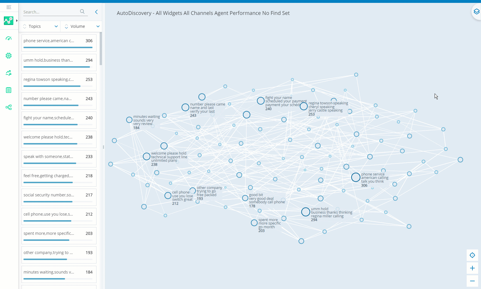
There are three areas in AutoDiscovery used for discovering and analyzing data:
- Map: Provides visual clues to immediately see if any topic groups stand out in your dataset. The initial view of the map is set to the Volume metric.
You can use the map controls or your mouse to zoom in and out on topics and phrases you want to view.
You can pan over the map by using the mouse to drag and move the map as required.
You can click
 to reset the map back to its original resolution.
|
Visuals on Map |
details |
|---|---|
| Circles | Represents a topic group. The color and size of circles corresponds with the metrics selected in the Data Layer panel. The size of a circle indicates the prevalence of the selected metric for each topic. |
| Topic Names | The top three phrases that appear most in the topic. |
| White Lines | Demonstrates semantic relationships between topics. A thick line represents a strong relationship between topics. A thin line represents a weak relationship. No line means there is no relationship between the topics. |
- Data Layer Panel: Allows you to select metrics you want to focus on. This panel displays the lowest and highest recorded values for each metric. The related value shows for each topic or phrase on the map. The initial view of the map is set to the Volume metric. For example, if the Volume metric displays 1 and 17 at either end of the metric slider, that means that the highest number of calls received during the selected date range was 17. You can access or hide the Data Layer panel by clicking
 .
. - Statistics Panel: Lists all the topics and phrases within the dataset. The data displayed in the Statistics panel will reflect changes you make in the Data Layer panel. You can sort topics and phrases alphabetically. You can also select a specific metric to focus on. That list of metric results can be sorted in ascending or descending order. You can access or hide the Statistics panel by clicking the arrow to the left of the map.
Understanding Metrics in AutoDiscovery
AutoDiscovery has a number of metrics that provide in-depth information about a selected topic or phrase.
|
metric |
description |
|---|---|
| Volume |
Total number of calls using the selected topic or phrase. The Statistics panel presents a graph with the volume data for the selected time period. You can click on points in the graph to see the volume per day. Volume is represented by circles ranging from light to dark blue on the map. The darker the shade of the blue, the higher the volume of calls for that topic. |
| Duration |
Length of a call between an agent and a customer. This can highlight specific issues that agents may find difficult to deal with or solve. Duration is represented by circles ranging from light to dark gray on the map. The darker the shade of gray, the longer the duration of calls. |
|
Anomaly |
Instances where there is an unusual trend in one of the metrics. There are likely unexpected changes or spikes in the data. This can help you to identify and resolve problems. Anomalies are represented by circles ranging from light to dark purple on the map. The darker the shade of purple, the higher the anomaly score. |
| Silence | Periods of silence where there is no conversation between customer and agent. This may indicate the agent is struggling to deal with the problem or is unsure how to proceed. Circles on the map will display in a gradient of shades of green, yellow, orange, and red. Dark green indicates a low percentage of silence. Red indicates a high percentage of silence. Colors ranging in between indicate intermediate percentages of silence. |
| Cross Talk | Periods where both customer and agent are speaking at the same time. Cross-talk may indicate conflict between customer and agent, or it can signify noncompliance of company policy regarding customer contact etiquette. Circles on the map will display in a gradient of shades of green, yellow, orange, and red. Dark green indicates where there were short periods of cross talk. Red indicates long periods of cross talk. Colors ranging in between indicate intermediate amounts of cross-talk. |
| Customer % | Percentage of time the customer spoke during the call. Circles on the map will display in a gradient of shades of green, yellow, orange, and red. Dark green indicates that customers spoke for a small percentage of calls. Red indicates that customers spoke more during calls. Colors ranging in between indicate that the customer spoke for an intermediate percentage of the call. |
| Sentiment |
Measures customer satisfaction and sentiment over the entire call. Sentiment is measured using AI and machine learning technology. Circles on the map will display in a gradient of shades of green, yellow, orange, and red. Dark green indicates positive sentiment. Red indicates negative sentiment. Colors ranging in between indicate neutral or mixed sentiments. |
| Negative % |
Measures the percentage of calls where sentiment is below a certain threshold. This threshold signifies the difference between customer satisfaction and negative sentiment. Circles on the map will display in a gradient of shades of green, yellow, orange, and red. Dark green indicates low negative sentiment. Red indicates high negative sentiment. Colors ranging in between indicate intermediate negative sentiment. |