

Required role: Supervisor, Manager
Refresh rate: 5 minutes for the circle chart, user-specified duration for the trending line
The Service Level widget compares the number of contacts that met the service level threshold to the ones that did not. This widget resets at midnight and uses the user's browser time zone.
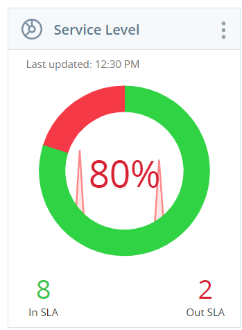
The In SLA number in green shows the number of contacts handled within the service level threshold. The Out of SLA number in red shows the number of contacts which have exceeded the threshold. The number in the center of the circle chart displays the percentage of contacts that meet the specified service level time.
If a skill has zero contacts within the time period selected, the service level will be 0%.
Trending Line
The line graph in the center of the circle chart shows which direction your SLA is trending. If the threshold is set to N/A, the color of the percentage matches that of the most recent trends. Green indicates a positive SLA trend and red indicates a negative SLA trend.
The trending line of the Service Level widget is determined by the slope of a “best-fit” line. The best-fit line is a line that the calculating process “draws”. The calculating process “draws” this best-fit line to approach, as closely as possible, the data points you specify. The number of data points that the best-fit line tries match is based on the parameters you choose for the Trending Intervals and Trending Duration fields in the Service Level widget’s settings. For example, if you set the Trending Intervals for 24 Intervals and the Trending Duration for 60 minutes, the calculating process would “draw” a line to come as close as possible to 24 data points, one data point every 60 minutes for 24 hours.
Depending on the values selected for the Trending Intervals and Trending Duration fields, the Trending Line (the slope of the best-fit line) can be positive or negative. This illustrates how the trending line is subjective and entirely based on the values you enter. It would not be uncommon or unusual for one set of Trending Intervals and Trending Duration values to return a positive trending line while a different set of values, for the exact same Service Level widget, to return a negative trending line.
A supervisor suspects that agents are not handling calls quickly enough. The service level threshold is set to 3 minutes for calls. The supervisor checks the SLA values and the trend line is mostly negative. Based on these statistics, action will need to be taken to resolve the issue.
Settings
Settings containing checkbox selections have a Select All and Deselect All option. These can be used to quickly pick and choose just the metrics needed to create a targeted display. The Agents and ACD Skills settings also have a search box for locating a specific agent or skill.
| Field | Description |
|---|---|
| Display Name | The customizable widget name |
| Campaigns | The campaign included in the widget |
| ACD Skills | The skill |
| Media Types | The media types (channels) are included in the service level calculations |
| Trending Intervals | The number of data points the trending line considers when determining a positive or negative trend |
| Trending Duration | The length of time in which the trending line refreshes |
| Threshold | The behavior of the central percentage. If set to N/A, the color reflects the trending line. If it is set to a static percentage, the color reflects whether the current percentage is above or below the selected threshold. |