The Dashboard tab provides real-time data on customer![]() The person on the other end of an interaction. conversations, messages, and intents
The person on the other end of an interaction. conversations, messages, and intents![]() The meaning or purpose behind what a contact says/types; what the contact wants to communicate or accomplish.. At a glance, you can track how your bot
The meaning or purpose behind what a contact says/types; what the contact wants to communicate or accomplish.. At a glance, you can track how your bot![]() A software application that handles customer interactions in place of a live human agent. is doing and identify specific areas for improvement.
A software application that handles customer interactions in place of a live human agent. is doing and identify specific areas for improvement.
View Your Dashboard
- In NiCE CXone, click the app selector
 and select Bot Builder.
 - Click the bot you want to work with.
- Click Insights
 in the left icon menu.
 - Click the Dashboard tab.
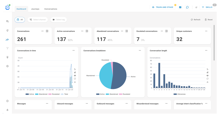
On the Dashboard tab, you can:
- View widgets that display various metrics and charts about how your customers are interacting with your bot.
- Filter the data by date, channel
 Various voice and digital communication mediums that facilitate customer interactions in a contact center., and tags.
 - Refresh the data to bring in the newest information.
- Reset the filters to their default values.
Widgets
The Dashboard page has 17 predefined widgets. There are conversation widgets, message widgets, and a tag widget. Some display a numerical metric and some display charts.
For each widget, you can either click any data point or click Show Conversations  to create a search query that shows all relevant conversations. When viewing the query, you can click Manage Search
  and enter a name for the query to save it for future use.
Numerical Metric Conversation Widgets
- Conversations: The total number of conversations handled by the bot.
- Active conversations: The total number of conversations that are currently being handled by the bot.
- Abandoned conversations: The total number of conversations that have only one inbound (customer The person on the other end of an interaction.) message and are older than one hour.
- Escalated conversations: The total number of conversations that have been escalated to a live agent.
- Unique customers: The total number of unique customers that have interacted with the bot.

Chart Conversation Widgets
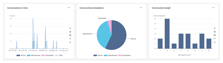
- Conversations in time: Compares the evolution of all conversations. The data is split into active, abandoned, and escalated conversations.
View chart details
The X-axis is the timeline. The Y-axis is the number of conversations.
For this widget, you can:
- View as a line chart
 . The line represents the total number of conversations.
 - View as a bar chart
 . Each bar is split into active, abandoned, and escalated conversations.
 - Stack the data
 . This view displays the active, abandoned, and escalated bars on the same vertical plane.
 - Restore the default chart view
 .
. - Download the current chart view as an image
 .
. - Configure the timeline for the X-axis. Click Options
 , then click Configure. For Split date range by, you can select Hour, Day, Week, Month, or Year. The default is Day.
- View as a line chart
-
Conversations breakdown: Compares conversation types. The data is split into Active, Abandoned, and Escalated conversations. The data in this pie chart correlates to the data in the numerical metric widgets of the same names.
-
Conversation length: Shows how many conversations have the same number of inbound (customer
The person on the other end of an interaction.) messages.View chart details
The X-axis is the number of inbound messages. The Y-axis is the number of conversations that have each number of messages.
For this widget, you can:
- View as a line chart . The line represents the total number of conversations.
- View as a bar chart . Each bar is split into active, abandoned, and escalated conversations.
- Stack the data . This view displays the active, abandoned, and escalated bars on the same vertical plane.
- Restore the default chart view .
- Download the current chart view as an image .
- View as a line chart
Numerical Metric Message Widgets
- Messages: The total number of both inbound and outbound messages.
- Inbound messages: The total number of inbound messages (from customers The person on the other end of an interaction.).
- Outbound messages: The total number of outbound messages (from the bot A software application that handles customer interactions in place of a live human agent.).
- Misunderstood messages: The total number of messages that required NLU fallback.
- Average intent classification %: The average percentage of intents The meaning or purpose behind what a contact says/types; what the contact wants to communicate or accomplish. the bot classified correctly.
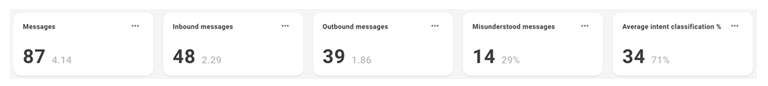
Chart Message Widgets
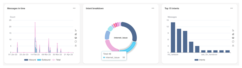
- Messages in time: Compares how many messages there were over time. The data is split into inbound, outbound, and total messages. View chart details
The X-axis is the timeline. The Y-axis is the number of messages.
For this widget, you can:
- View as a line chart . Each line represents either inbound, outbound, or total messages.
- View as a bar chart . Each bar represents either inbound, outbound, or total messages.
- Stack the data . This view displays the inbound, outbound, and total bars on the same vertical plane.
- Restore the original chart view .
- Download the current chart view as an image .
- Configure the timeline for the X-axis. Click Options , then click Configure. For Split date range by, you can select Hour, Day, Week, Month, or Year. The default is Day.
- View as a line chart
- Intent breakdown: Compares classified intents The meaning or purpose behind what a contact says/types; what the contact wants to communicate or accomplish.. Each section of the pie chart represents a different intent and shows how many inbound messages were classified for that intent. An additional section shows misunderstood messages, which are messages that used NLU Fallback.
- Top 15 intents: Shows the inbound message count for the top 15 classified intents.View chart details
The X-axis is the intent name. The Y-axis is the number of messages with that intent.
For this widget, you can:
- View as a line chart . The line represents the total number of messages.
- View as a bar chart . Each bar represents a different intent.
- Stack the data . This view displays the different data points on the same vertical plane.
- Restore the original chart view .
- Download the current chart view as an image .
- View as a line chart
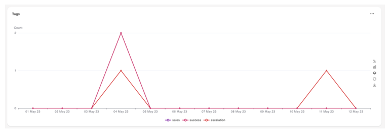
Tags Widget
Tags: Compares how often a tag is applied to a conversation over time.
The X-axis is the timeline. The Y-axis is the number of times a tag was applied to a conversation.
For this widget, you can:
- View as a line chart . Each line represents a tag.
- View as a bar chart . Each bar represents a tag.
- Stack the data . This view displays all bars for each X-axis timeline on one vertical plane.
- Restore the original chart view .
- Download the current chart view as an image .
- Configure the timeline for the X-axis. Click Options , then click Configure. For Split date range by, you can select Hour, Day, Week, Month, or Year. The default is Day.