Dashboard 选项卡提供有关客户![]() 处于交互另一端的人员。对话、消息和意图
处于交互另一端的人员。对话、消息和意图![]() 联系人所说/所输入内容背后的含义或目的;联系人想要传达或达成的事情。的实时数据。 您可以一目了然地跟踪机器人
联系人所说/所输入内容背后的含义或目的;联系人想要传达或达成的事情。的实时数据。 您可以一目了然地跟踪机器人![]() 代替现场人工坐席处理客户交互的软件应用程序。的绩效,并确定需要改进的具体领域。
代替现场人工坐席处理客户交互的软件应用程序。的绩效,并确定需要改进的具体领域。
查看您的 Dashboard
- 在 CXone Mpower 中单击应用程序选择器
 并选择Bot Builder。
 - 单击您要使用的机器人。
- 单击左侧图表菜单中的见解
 。
。 - 单击仪表板选项卡。
在仪表板选项卡上,您可以:
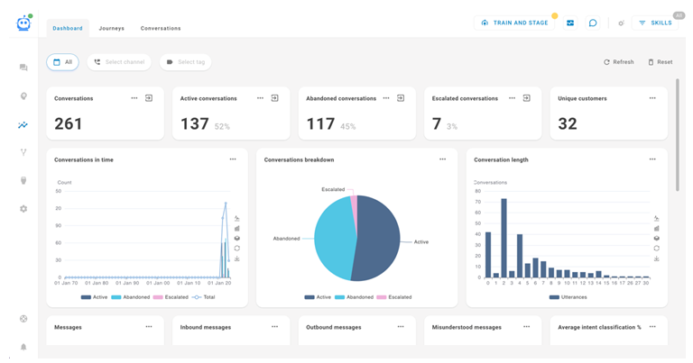
- 查看小部件,其中显示有关客户如何与机器人交互的各种指标和图表。
- 按日期、渠道
 联络中心中用于促进客户交互的各类语音和数字通信媒介。和标记筛选数据。
 - 刷新数据,获取最新信息。
- 将筛选器重置为其默认值。
小工具
仪表板页面包含 17 个预定义的小部件。 有对话小部件、消息小部件和标记小部件。 有些显示数字指标,有些显示图表。
对于每个小部件,您可以单击任何数据点或单击显示对话 ,创建显示所有相关对话的搜索查询。 查看查询时,您可以点击管理搜索
 并输入查询名称,以保存查询供将来使用。
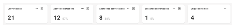
数字指标对话小部件
- 对话:机器人处理的对话总数。
- 活动对话:机器人当前正在处理的对话总数。
- 弃呼对话:只有一条呼入(客户 处于交互另一端的人员。)信息且超过一小时的对话总数。
- 升级对话:已升级至真人坐席的对话总数。
- 唯一客户:与机器人交互的唯一客户总数。
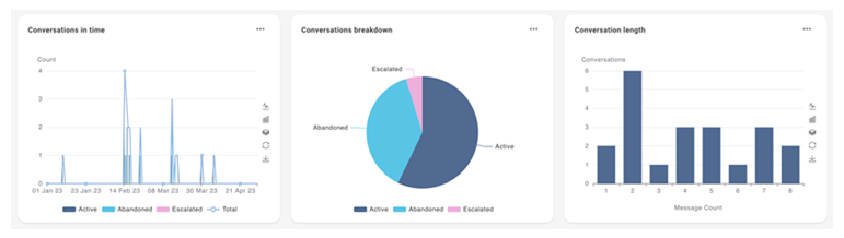
图表对话小部件
- 一段时间内的对话:比较所有对话的演变过程。 数据分为活动对话、弃呼对话和升级对话。 查看图表详细信息
X 轴为时间线。 Y 轴为对话数量。
对于此小部件,您可以:
- 以折线图形式查看
 。 该线代表对话总数。
 - 以条形图形式查看
 。 每个条形图均分为活动、弃呼和升级的对话。
 - 叠加数据
 。 该视图在同一垂直平面上显示活动、弃呼和升级的条形图。
 - 恢复默认图表视图
 。
。 - 以图片形式下载当前图表视图
 。
。 - 配置 X 轴的时间线。 单击选项
 ,然后单击配置。 对于按分割日期范围,您可以选择小时天、周、月或年。 默认为天。
- 以折线图形式查看
-
对话细分:比较对话类型。 数据分为活动对话、弃呼对话和升级对话。 该饼图中的数据与同名的数字指标小部件中的数据相关。
-
对话长度:显示有多少对话具有相同数量的呼入(客户
处于交互另一端的人员。)消息。查看图表详细信息
X 轴为呼入消息的数量。 Y 轴为每种信息数量的对话数量。
对于此小部件,您可以:
- 以折线图形式查看。 该线代表对话总数。
- 以条形图形式查看。 每个条形图均分为活动、弃呼和升级的对话。
- 叠加数据。 该视图在同一垂直平面上显示活动、弃呼和升级的条形图。
- 恢复默认图表视图。
- 以图片形式下载当前图表视图。
- 以折线图形式查看
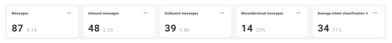
数字指标消息小部件
- 消息:呼入和呼出消息的总数。
- 呼入消息:呼入消息总数(来自客户 处于交互另一端的人员。)。
- 呼出消息:呼出消息总数(来自机器人 代替现场人工坐席处理客户交互的软件应用程序。)。
- 被误解的消息:需要 NLU 回退的消息总数。
- 平均意图分类 %:机器人正确分类意图 联系人所说/所输入内容背后的含义或目的;联系人想要传达或达成的事情。的平均百分比。
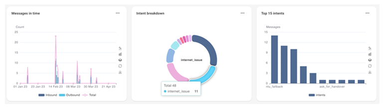
图表消息小部件
- 一段时间内的消息:比较一段时间内的消息数量。 数据分为呼入消息、呼出消息和总消息。 查看图表详细信息
X 轴为时间线。 Y 轴为消息数。
对于此小部件,您可以:
- 以折线图形式查看。 每条线代表呼入消息、呼出消息或总消息。
- 以条形图形式查看。 每个条形图代表呼入消息、呼出消息或总消息。
- 叠加数据。 此视图在同一垂直平面上显示呼入、呼出和总条形图。
- 恢复原始图表视图。
- 以图片形式下载当前图表视图。
- 配置 X 轴的时间线。 单击选项,然后单击配置。 对于按分割日期范围,您可以选择小时天、周、月或年。 默认为天。
- 以折线图形式查看
- 意图细分:比较分类意图 联系人所说/所输入内容背后的含义或目的;联系人想要传达或达成的事情。。 饼图的每个部分代表不同的意图,并显示有多少呼入消息被归类为该意图。 附加部分显示了被误解的消息,这些消息使用了 NLU 回退。
- 前 15 个意图:显示前 15 个分类意图的呼入消息计数。 查看图表详细信息
X 轴为意图名称。 Y 轴为具有该意图的消息数。
对于此小部件,您可以:
- 以折线图形式查看。 该线代表消息总数。
- 以条形图形式查看。 每个条形图代表不同的意图。
- 叠加数据。 此视图在同一垂直平面上显示不同的数据点。
- 恢复原始图表视图。
- 以图片形式下载当前图表视图。
- 以折线图形式查看
标记小部件
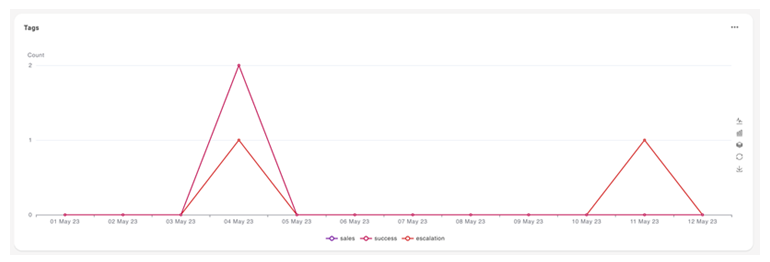
标记:比较一段时间内将标记应用于对话的频率。
X 轴为时间线。 Y 轴为对话中使用标记的次数。
对于此小部件,您可以:
- 以折线图形式查看。 每条线代表一个标记。
- 以条形图形式查看。 每个条形图代表一个标记。
- 叠加数据。 此视图在一个垂直平面上显示每个 X 轴时间线的所有条形图。
- 恢复原始图表视图。
- 以图片形式下载当前图表视图。
- 配置 X 轴的时间线。 单击选项,然后单击配置。 对于按分割日期范围,您可以选择小时天、周、月或年。 默认为天。