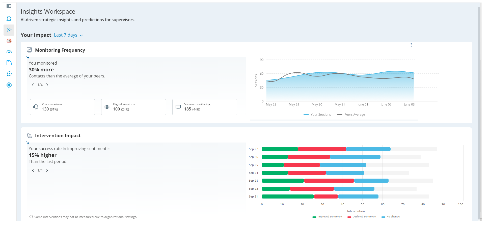
The first phase of the Insights Workspace introduces two new metrics to evaluate supervisors’ performance and impact: Monitoring Frequency and Intervention Impact. These metrics are based on performance parameters and offer detailed information for selected date ranges.
The available evaluation periods are:
-
Yesterday
-
Last 7 days (Default)
-
Last 14 days
-
Last 30 days
-
Custom Dates
These metrics help quantify performance compared to previous periods and peers. Monitoring Frequency shows details and insights for screen, voice, and digital monitoring.
Intervention Impact displays details and insights related to supervisor interventions for coaching or joining sessions.
Both insights are available in chart and tabular format based on the selection.
Supervisors use these features to evaluate and improve their performance.
License and Permissions:
This page is available to users with Copilot for Supervisors license.
In addition, your role must have permissions turned ON for Insights Workspace in Admin > Roles & Permission > Permissions > Supervisor >Copilot for Supervisors. Learn more about permissions here.
Monitoring Frequency Insights
Monitoring Frequency refers to the regularity with which supervisors monitor interactions. Metrics data is displayed for three types of monitoring: Voice, Digital, and Screen. This comprehensive view ensures you have all the necessary information at your fingertips.
These insights help to:
-
Evaluate the effectiveness of monitoring activities.
-
Understand monitoring patterns.
Target goals are calculated based on the average counts of monitoring done by other supervisors (peers) for the selected period.
Monitoring Insights include:
-
Monitoring fewer or more contacts than peers.
-
You monitored 20% fewer contacts than the average of your peers.
-
You monitored 25% more contacts than the average of your peers.
-
Increased or decreased monitoring compared to last the period.
-
On average, you monitored 30% more contacts than last period.
-
On average, you monitored 15% fewer contacts than last period.
-
Monitoring fewer or more hours than peers.
-
You monitored 01:30 hours less than the average of your peers.
-
You monitored 02:00 hours more than the average of your peers.
-
Distribution of monitoring types.
-
Last week, 60% of monitored contacts were from live monitoring, and 40% from alerts.
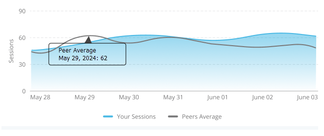
Monitoring Frequency Chart
Horizontal direction: Displays the period of monitoring frequency, which changes based on the selected period filter.
Vertical direction: Displays the monitored count.
How to Read the Chart:
Hover over the chart to see the date, monitoring counts, and average monitoring duration per contact. Metrics data is displayed for voice, digital, and screen monitoring. The chart also shows target goals based on the average counts of monitoring done by peers. If Yesterday is selected, hourly data is shown on hover. The target line is not displayed if no peers are available or if peers’ data is not available for the selected period.
Intervention Impacts
Intervention Impact measures the effect of a supervisor’s intervention during interactions, focusing on sentiment changes.
These insights help to:
-
Assess the effectiveness of interventions.
-
Help supervisors improve their coaching strategies.
Intervention Impact insights include:
-
Lower or higher success rate in improving sentiment compared to the last period.
-
Your success rate in improving sentiment is 10% lower than the last period.
-
Your success rate in improving sentiment is 15% higher than the last period.
-
Higher or lower success rate in improving sentiment compared to peers.
-
Your success rate in improving sentiment is 20% higher than your peers.
-
Your success rate in improving sentiment is 12% lower than your peers.
-
Increased or decreased interventions compared to last period.
-
You intervened 25% more contacts than the last period.
-
You intervened 18% fewer contacts than the last period.
-
Distribution of improved contacts from monitoring types.
-
Last week, 70% of improved contacts were from live monitoring, and 30% from alerts.
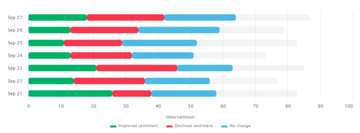
Intervention Impact Chart:
Horizontal direction: Displays counts of improved sentiments, declined sentiments, no change sentiments, and un-tracked sentiments.
Vertical direction: Displays the period of intervention impact, which changes based on the selected period filter.
How to Read the Chart:
Hover over the chart to see intervention impact counts for each sentiment state. The chart displays metrics for join and coach actions. Sentiment movement is measured from the moment of supervisor intervention to the end of the call.


