Actions enhance your data analysis experience by allowing you to visualize response data in graphical formats.
Data refresh rate: Up to 4 hours
Create or View as Chart
After you submit your prompt, you receive a response containing relevant data. To visualize this data in a graphical format, click Create Chart/View as Chart. The middle panel shows the chart only when you decide to view the data as a chart.
-
Supported Visualizations
Actions selects the best visualization type based on the data and currently supports four types of graphical visualizations.
Table, Bar Graph, Pie Chart, or Trend Lines. If your data has more than two dimensions, the pie chart option will not be displayed.
You can change the representation by clicking icons at the top. You can only make applicable visualizations available.
-
Widget Title
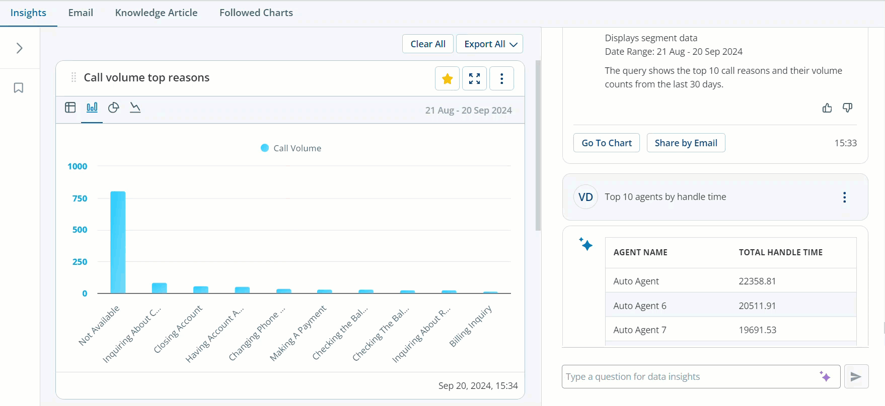
When you click View as Chart, the widget title displays a shorter and easy-to-understand version of the original question. For example, if the question was What are the top 10 call reasons?,Actions generative AI technology creates a simple summary to display as the widget title.
-
Time stamp and Data Context
The time stamp you see next to your response shows when that specific data was generated. It doesn't continuously update with new data, but instead, it reflects the information at the moment you asked your question. If you revisit the page at a later time, the time stamp displays the original time when the data was provided, for example, Yesterday 10:02.
-
Chart customization
Click settings to:
-
Rename the Chart: Customize the chart title.
-
Delete the Chart: Remove it if you no longer need it.
 Use Case: Enhanced Data Analysis with Charts
You've submitted a prompt and received the response. For better visualization, you click View as Chart, and your data gets converted into a graph. Actions intelligently picks the best visualization type based on your data, be it a table, bar graph, pie chart, or trend lines.
Using generative AI technology, it also creates an easy-to-understand widget title from your original question. The chart includes a timestamp indicating when the data was generated, providing the exact context.
You can further customize your chart by renaming or deleting it as required.
-
-
Feedback on responses
You can provide feedback on conversational responses which can help in improving the quality of the responses. You can click in the Thumbs up to provide a positive response or the Thumbs down if you are not satisfied with the response.
Followed Charts
The Followed Charts feature in Actions allows you to monitor specific data visualizations regularly. Whether it’s a critical metric, a performance trend, or an essential KPI, you can keep track of it effortlessly. The primary objective is to provide a fixed dashboard for regular monitoring. Operations managers can access these charts daily or weekly to track critical insights.
-
Following a Chart
After you visualize the data, if you want to monitor it regularly, click the Follow on the chart. The chart is added to your Followed Charts section.
Access all the charts you’ve followed in one place on the Followed Charts tab. The Followed Charts tab displays a consolidated view of your chosen visualizations.
-
Data Refresh
When you first open the Followed Charts, it gets refreshed. If you navigate to other tabs and return to Followed Charts, the data isn’t immediately refreshed. However, switching to another application and returning to Followed Charts triggers a data refresh.
It does not display real-time data but the state at the time of your last refresh.
-
Unfollow a Chart
If you no longer need to monitor a specific chart, you can unfollow it. On the middle panel options to remove a chart from your Followed Charts. You can also do this from the Followed charts page or from the middle panel on the Insights tab.
Example
If you're monitoring the performance of your agents, you can follow the Top 10 Agents chart. Whenever you access Followed Charts, it displays the performance rankings up to the last refresh. This feature ensures you stay updated on your team's performance without the need for constant real-time updates.
-
Exporting Data
You can export individual visualizations or all charts in either Excel, PowerPoint or JPEG format.
-
What should I know today
You can compare metrics from two distinct time periods – the current period and a previous one.
It includes a comparative visualization for each question in the Followed Chart, and the previous period is determined by taking the exact preceding period. If the current period is the last five days, the previous period would be the five days before that.
You can also switch between the two comparative periods. A generative AI-powered insight describes the differences between the comparative periods. You can export individual charts or export all, depending on which chart is displayed.
Mark is the operations manager for a large contact center. He wants to analyze the performance of different teams to identify areas for improvement and spot trends in the reasons customers call the call center.
Mark uses the following steps:
-
Mark asks questions such as “Show me the bottom 5 teams with the highest average handle time for the last week,” “Show me 5 teams with lowest customer satisfaction scores” to look for areas of improvement, and “Show me the top 10 reasons for customer calls in the last quarter.”
-
He generates a chart for each query and clicks the star icon to follow the charts.
-
Mark visits the Followed Charts page to view each of the charts. He can see the charts for his following questions across two time periods (last week vs. the previous week, last month vs. the previous month, and last quarter vs. the previous quarter). He reviews the comparative insights to know whether there are teams that continue to have poor customer satisfaction scores and if there are any new entrants. Also, he analyzes if there are any trending call reasons.
Based on his analysis within Actions, Mark can identify teams with high average handle times and teams with high customer satisfaction scores. However, Mark would need to leverage practices, and assess resource needs based on common call reasons.
By following relevant charts and comparing data across different time periods, Mark can quickly identify trends, spot opportunities for improvement, and make data-driven decisions to enhance the contact center's overall performance.