

As an operations manager, you need to monitor and analyze key customer service metrics. Actions provides an anomaly detection panel for voice and digital channels , where you can see anomalies, or unexpected deviations from normal values.
For digital channels, anomaly detection is currently limited to chat only.
For each anomaly, Actions provides insights and root cause analysis for why the anomaly is occurring. Historical data is available for root cause analysis and corrective actions.
The anomaly detection panel appears across the top of the Actions page.
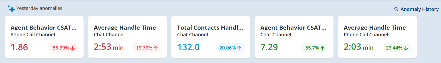
The panel highlights anomalies detected for the previous day across key metrics. The metrics tracked for anomalies include:
-
Total Contacts Handled
-
Average Handle Time
-
After Call Work
-
Customer Sentiment Score
-
Resolution Rate
-
Agent Behavior CSAT Score
Notes About Reading the Anomaly Detection Panel
-
Anomalies are listed based on their severity, with red metrics (highest deviation) shown first, followed by neutral metrics in blue, and then green metrics (highest positive deviation).
-
An anomaly doesn't necessarily mean that the metric is bad or undesirable.
-
Arrows and color coding indicate anomaly status:
-
Red for negative
-
Green for positive
-
Blue for neutral
-
Down arrows for metrics below the lower boundary
-
Up arrows for metrics above the upper boundary
For example, when a metric is below the lower boundary, a red down arrow is used. When a metric is above the upper boundary, a green up arrow is used. When a metric is within the expected range, a blue neutral arrow is used.
-
-
The value shown for an anomaly depends on the metric and its type of unit. Some metrics show a time value. Others show a percentage value. For example, for Average Handle Time and After Call Work, the time unit is shown, but for Resolution rate a percentage is shown.
-
Anomaly data is calculated based on the region you operate in:
-
NA1: Pacific Standard Time
-
CA1: Central Time
-
AU: Australian Eastern Standard Time
-
EU: Central European Standard Time
-
UK: Greenwich Mean Time
-
-
To hide the anomalies detection panel, click the Anomalies toggle.
-
Total Contacts Handled: This metric is considered neutral, and the color coding is blue.
-
Average Handle Time: A lower handle time is considered good, so a lower-than-expected value would be marked as a green anomaly.
-
Customer Sentiment Score: If the actual score is higher than the forecast, it is considered a good anomaly and marked in green.
-
Resolution Rate: A higher resolution rate is desirable, so a higher-than-expected value would be marked as a green anomaly.
Displaying the Insights and Root Causes for Anomalies
To view additional details about an anomaly, click an anomaly card in the anomaly detection panel. The anomaly details panel appears and displays:
-
Insights: The insights for an anomaly include the upper and lower boundaries for the metric, as well as the deviation from the expectation.
-
Top Three Contributors: Using root cause analysis, Actions shows the top three contributors to the anomaly. The contributors can be values for these entities: Teams, Skills, or Contact Reason. By knowing what is influencing the anomaly, you can make better decisions about your data and take corrective actions sooner.
The possible contributors to the anomaly vary based on the metric:
Metric contributors Total Contacts Handled Teams, Skills Average Handle Time
Teams, Skills
After Call Work
Teams, Skills
Customer Sentiment Score
Teams, Skills, Contact Reason Resolution Rate
Teams, Skills, Contact Reason Agent Behavior CSAT Score Teams, Skills, Contact Reason The distribution for the top three contributors can be any combination of the root causes that impact the metric. For example, if the top three contributors for the Total Contacts Handled metric might be three different skills, three different teams, or a combination of two different skills and one team.
To summarize the insights and root cause of an anomaly, go to the Anomaly History popup, click Create Chart to create an anomaly summary. Click Go to Chart to view it in the Insights section. Based on the summary, you can further investigate the anomaly by asking natural language questions.
Anomaly History
-
You can access the anomaly history to access past anomalies by clicking on a history icon or by clicking on an anomaly card. The anomaly history displays the selected metric by default, for example, if you click the Customer Sentiment Score card, it displays the anomaly history for that metric. You can select different time periods, such as the last 7 days (default), last 30 days, last 90 days, or a custom range.
-
You can select a specific metric to view its anomaly history. The anomaly graph history displays a funnel-like graph that captures the upper and lower boundaries for each day as the funnel boundaries. The graph shows a line for the forecasted value per day and a line for the actual value on that day. You can hover over the lines to view all the values. You can also zoom to focus on a specific time period,
-
You can choose to include or exclude weekends from the graph (weekends are excluded by default).
-
Some metrics, such as CSAT, Overall Behavior Score, and IA Resolved, are available only if you have the appropriate license (IA Advanced or Premium). Additionally, the availability of data may be limited to a certain date range, depending on the data available.